Background
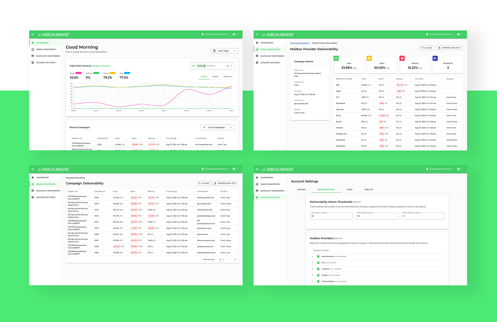
InboxAware is a web-based email deliverability app for inbox placement and advanced analytics. InboxAware offers a holistic overview of your emails’ performance as well as advanced analytics that allow you to deep-dive into each factor that impacts your email performance and inbox placement.
My Role
In my role as a Senior UX Manager, I guided and coached InboxAware UX team, as well as contributed to a successful product launch. In short, I was accountable for the UX effort to design new product.
This case study is a glimpse into how I lead my team towards positive outcomes.
Process
My focus was to lead a high-pressure effort to design and launch the InboxAware. Two UX designers and a technical writer executed the day to day work under my guidance. My team's starting objective: design MVP version of the platform.
I worked closely with engineering, product, and deliverability teams to create a strategic roadmap. I guided UX team, provided feedback, and ensured cross-functional collaboration.
The UX team's cross-functional partners in product and engineering wanted to move quickly with the assumption that they didn't have the time for user research. However, I ensured that UX and product teams consulted our own subject matter experts - the deliverability team - who actually represented key user profiles that InboxAware was intended for! This approach allowed us to move quickly, while validating our assumptions and testing usability.
Soft Launch
InboxAware was first adopted by our own company. Our team test-drove the platform offering their first 'unfiltered' view of the product. This allowed us to quickly make improvements before we offered InboxAware to a wider audience outside of our walls.
Challenges & Outcomes
How to design a filter
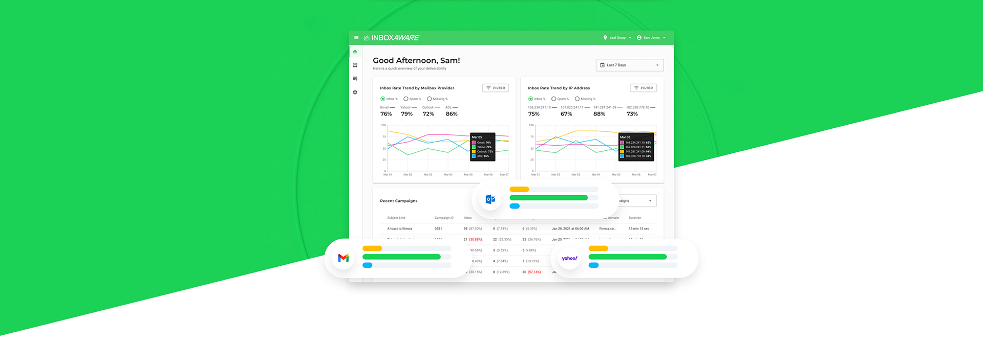
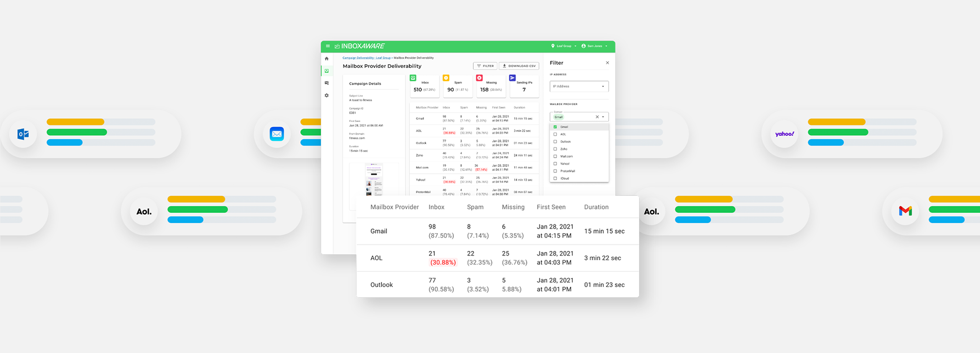
InboxAware provides advanced analytics that allow you to deep-dive into each factor that impacts your email performance and inbox placement. In our product, this translated into a sophisticated filtering options that would allow each user to find a very narrow data point at any given time on any given screen.
InboxAware UX team had to solve this design challenge, which took a few rounds of improvements. We often consulted engineering and data analytics team and conducted many, many rounds of usability testing.
We developed a set of patterns and filter layouts that could be used on any screen of the platform without disrupting the overall structure. This allowed us to choose what filter options would be included for every section, making the filtering experience more custom.
Numbers don't have to be boring
Inbox Aware is a data and numbers heavy platform - this means lots and lots of digits on all screens. How do you make numbers to tell you a story at-a-glance? That was another challenge that my UX team had to overcome.
To solve this challenge we used UI best practices and played with the visual hierarchy. We opted to use some visual components, such as graphs/charts, icons, and colour treatments to add interest and emphasis.
Successful Launch = Happy Clients
After the launch there were many subscription sign-ups, which is always a great sign when you launch a new product. Since the launch, the teams have started working on more advanced features as we are continuing to grow InboxAware.